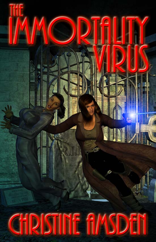
For those of you who have been following my posts, you know that a couple of weeks ago, my publisher and I decided to tweak the cover art for The Immortality Virus. This came after we received some negative feedback, especially about the size of the breasts on the second character. I agreed with the sentiment, but not being a visual artist, had kind of left most of the details to the artist, who I thought generally captured the scene (straight from the book) fairly well. Well, the new version is in, and I am much happier with it. Not only is that second character a bit more reasonably proportioned, but the way she’s falling looks more believable, and I like the look on her face better. I also like the lighting in the new version, particularly how the phasor casts a blue glow, brightening the scene. So, here it is:
And, for the sake of comparison, here is the old cover art, also the cover art on the ARCs:


